
Tuesday, November 29, 2011
VOCAB Assignment: Ian Cameron, Sunstar Cove Bay, May 6 2008
foreground, middleground, background: The foreground, middleground, and background in a composition are generally divided into three planes. The foreground of a composition is the visual plane that appears closest to the viewer, while the background is the plane in a composition percieved furthest from the viewer. The middleground is the visual plane located between both the foreground and background. The scale of these components often correlates to the dominance in an image. The foreground is often the most dominant due to the larger percieved scale of the images objects. This is not always the case, however, as definition and other factors can shift the dominance of the composition.
VOCAB Assignment: (picture of canvas)
picture plane: A picture plane is the imaginary flat surface which is usually located between the station pointand the object being viewed and is ordinarily a vertical plane perpendicular to the horizontal projection of the line of sight to the object's order of interest.
In painting the picture plane refers to the flat surface of the canvas or the physical material onto which the paint is applied. It generally refers to the front of the surface image, especially in the case of illusionary depth, although it can also refer to the picture's ground. The illusion of depth and three dimensionality that accompanies certain types of pictures is described as penetrating the picture plane.
VOCAB Assignment: Andy Warhol, Banana, 1966
postmodernism: Postmodernism is a philosophical movement evolved in reaction to modernism, the tendency in contemporary culture to accept only objective truth and to be inherently suspicious towards a global cultural narrative or meta-narrative. Postmodernist thought is an intentional departure from the previously dominant modernist approaches. The term "postmodernism" comes from its critique of the "modernist" scientific mentality of objectivity and the progress associated with the Enlightenment. Modernism and postmodernism are understood as a cultural stance or set of perspectives. "Postmodernism" is used in critical theory to refer to a point of departure for works of literature, drama, architecture, cinema, journalism, and design. It has also influenced marketing, business and the interpretation of law, culture, and religion in the late 20th and early 21st centuries. Postmodernism, particularly as an academic movement, can be understood as a reaction to modernism in the Humanities. Whereas modernism was primarily concerned with principles such as identity, unity, authority, and certainty, postmodernism is often associated with difference, plurality, textuality, and skepticism.

VOCAB Assignment: Hans Hofmann, The Gate, 1959-1960
modernism: Modernism, in its broadest definition, is modern thought, character, or practice. More specifically, the term describes the modernist movement, its set of cultural tendencies and array of associated cultural movements, originally arising from wide-scale and far-reaching changes toWestern society in the late 19th and early 20th centuries. The modernist movement, at the beginning of the 20th century, marked the first time that the term "avant-garde", with which the movement was labeled until the word "modernism" prevailed, was used for the arts (rather than in its original military and political context). Surrealism gained fame among the public as being the most extreme form of modernism, or "the avant-garde of modernism"

VOCAB Assignment: Albrecht Durer, Six Pillows, 1493
crosshatching: Crosshatching is an extension of hatching, which uses is the use of fine parallel lines drawn closely together, to create the illusion of shade or texture in a drawing.
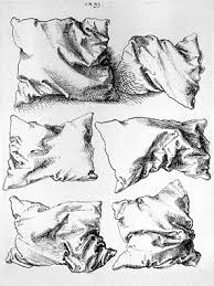
Crosshatching is the drawing of two layers of hatching at right-angles to create a mesh-like pattern. Multiple layers in varying directions can be used to create textures. Crosshatching is often used to create tonal effects, by varying the spacing of lines or by adding additional layers of lines. Crosshatching is used in pencil drawing, but is particularly useful with pen and ink drawing, to create the impression of areas of tone, since the pen can only create a solid black line.
VOCAB Assignment: Michelangelo, Creation of Adam, 1511
foreshortening: Foreshortening is a technique used in perspective to create the illusion of an object receding strongly into the distance or background.

VOCAB Assignment: Sandro Botticelli, The Birth of Venus, 1486
iconology: Iconology is the study of the meaning contained within the symbols in a particular work of art. For example, Caravaggio painted several martyred saints. But the figure crucified upside-down is a reference to St. Peter who, claiming himself unworthy to die in the same manner as Jesus, opted for the head-down position. So, in this particular painting the cross refers not only to Christianity but to humility as well.

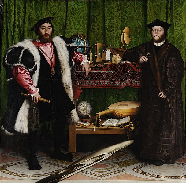
VOCAB Assignment: Hans Holbein the Younger, The Ambassadors, 1533
iconography: Iconography is the branch of art history which studies the identification, description, and the interpretation of the content of images. The word iconography literally means "image writing", and comes from the Greek εἰκών "image" and γράφειν "to write". A secondary meaning is the painting of icons in the Byzantine and Orthodox Christian tradition. Still in art history, an iconography may also mean a particular depiction of a subject in terms of the content of the image, such as the number of figures used, their placing and gestures. The term is also used in many academic fields other than art history, for example semiotics and media studies, and in general usage, for the content of images, the typical depiction in images of a subject, and related senses. Sometimes distinctions have been made between Iconology and Iconography, although the definitions, and so the distinction made, varies.
VOCAB Assignment: Vincent Van Gogh, Self Portrait, 1889
monochromatic: Monochromatic colors are all the colors (tints, tones, and shades) of a single hue. Monochromatic color schemes are derived from a single base hue, and extended using its shades, tones and tints (that is, a hue modified by the addition of black, gray (black + white) and white. As a result, the energy is more subtle and peaceful due to a lack of contrast of hue. Monochromatic color schemes may be considered boring unless there is diversity within the design.

VOCAB Assignment: Vincent van Gogh, Sunflowers, 1888
analogous color scheme: Analogous colors are colors that are adjacent to each other on the color wheel. Some examples are green, yellow green, and yellow or red, red violet and violet. Analogous color schemes are often found in nature and are pleasing to the eye. The combination of these colors give a bright effect in the area, and are able to accommodate many changing moods. When using the analogous color scheme, one should make sure there is one hue as the main color.

VOCAB Assignment:Tracy Haines, Stroll Along Platte, May 4 2010 (published in her blog)
complementary color scheme: Colors that are opposite each other on the color wheel are considered to be complementary colors (example: red and green). The high contrast of complementary colors creates a vibrant look especially when used at full saturation. This color scheme must be managed well so it is not jarring. Complementary colors are tricky to use in large doses, but work well when you want something to stand out.

VOCAB Assignment: Henri Matisse, Magnolia, c. 1900
contour line: Contour means "outline", and presents exterior edges of objects. A plain contour has a clean, connected line, no shading and emphasizes an open "shell" of the subject. More complex contours can imply shading values through interior outlines, may have line textures or be contrasted with mixed media. Pencil drawing, ball point pen and black markers are good practice tools.

VOCAB Assignment: Giovanni Baglione, Sacred and Profane Love, 1602-1603
chiaroscuro: Chiaroscuro in art is "an Italian term which literally means 'light-dark'. In paintings the description refers to clear tonal contrasts which are often used to suggest the volume and modelling of the subjects depicted".
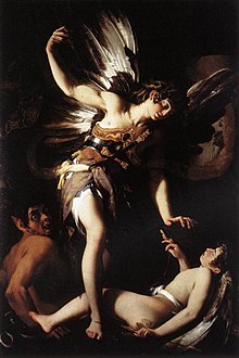
Further specialized uses include chiaroscuro woodcut, for colored woodcuts printed with different blocks, each using a different coloured ink; and chiaroscuro drawing for drawings on colored paper with drawing in a dark medium and white highlighting. Similar effects in the lighting of cinema and photography are also chiaroscuro.
VOCAB Assignment: Jan van Eyck, The Arnolfini Portrait, 1434
pentimento: A pentimento (plural pentimenti) is an alteration in a painting, evidenced by traces of previous work, showing that the artist has changed his mind as to the composition during the process of painting. The word derives from the Italian pentirsi, meaning to repent. 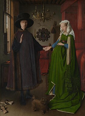
Among other changes, his face was higher by about the height of his eye, hers was higher, and her eyes looked more to the front. Each of his feet was under drawn in one position, painted in another, and then overpainted in a third. These alterations are seen in infra-red reflectograms.
VOCAB Assignment: Leonardo da Vinci, Mona Lisa, c. 1503-1505
Sfumato: Sfumato is one of the four canonical painting modes of the Renaissance (the other three being Cangiante, Chiaroscuro, and Unione)
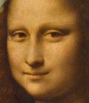
The most prominent practitioner of sfumato was Leonardo da Vinci, and his famous painting of the Mona Lisa exhibits the technique. Leonardo da Vinci described sfumato as "without lines or borders, in the manner of smoke or beyond the focus plane."
Wednesday, November 9, 2011
Matisse Painting


Subscribe to:
Posts (Atom)